5 Landing Page Mistakes You Want to Avoid
As digital marketers, one of our most precious tools is landing pages, yet, we oversee many common mistakes, which we can fix quickly and eventually increase conversion rates.
As digital marketers, one of our most precious tools is landing pages. A landing page is a web page (as opposed to a website) to a user arrives at after clicking on a search result link or an online ad. With the right landing page, you can substantially increase the number of leads generated for your business, successfully market sales propositions, and much more.
5 Landing Page Mistakes You Want to Avoid
There are different types of landing pages that serve different goals. For example, there is a lead generation or product sale landing page and each is designed for different purposes. Before you jump into building a landing page, ask yourself a simple question first: What do I need it for?
Let’s assume you want to generate more leads; therefore, you must have a noticeable and simple lead form to leave details. You shouldn’t include a phone number to call to (because it will confuse your viewers). Or if you want to sell using your landing page, make sure you have a Q&A section and a secure payment link. Whether your customer’s goal is generating leads or sales, keep in mind that a successful landing page will generate conversions, and your goal is to make them convert more, in other words- improve the conversion rate.
In this article, we´ve gathered the most common mistakes that companies do with their landing pages that you should be aware of. Regardless of the type of landing page, you’re working on right now, if you manage to avoid these mistakes, your conversion rates will rise drastically. So, let’s get started!

1. Not taking A/B testing seriously
Best practices are important, but working with only one version of your landing page is not a good idea. Whether your CEO thinks the CTA should be in glittery gold or your marketing manager insists on the headline to be five words only, the best way is to base your decisions on data and not on gut instinct.
To get on the road, here are some ideas for elements that you can test:
- Message – hard sell text vs. soft sell
- Text length – long text vs. short text.
- Color selection – research shows that having your CTA in green improves the conversion rate. It might not be relevant to all industries, but it’s worth testing!
- CTA placing – visitor’s eyes are naturally drawn to the center of the page therefore you would want to place your CTA somewhere in the center and, of course, test it.
- Creative type – video vs. images. Although videos are proven to drive more attention and increase conversion rates, a simple image might do the work.
Keep in mind that you should test one element at a time in order to know which one caused the results to change.
Pro tip: “Unbounce” builder is a great tool that lets you split traffic between variants and then tracks the pages that performed better. Together with tracking tools like Google Analytics, Hotjar, VWO, and LeadsRX, you can get a full picture to optimize your page.
2. Choosing the wrong structure – F- Shaped vs. Z-shaped
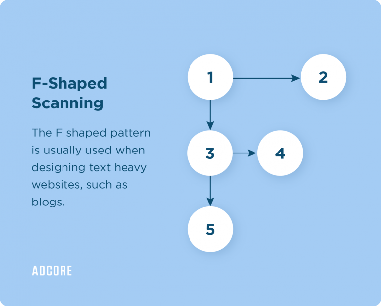
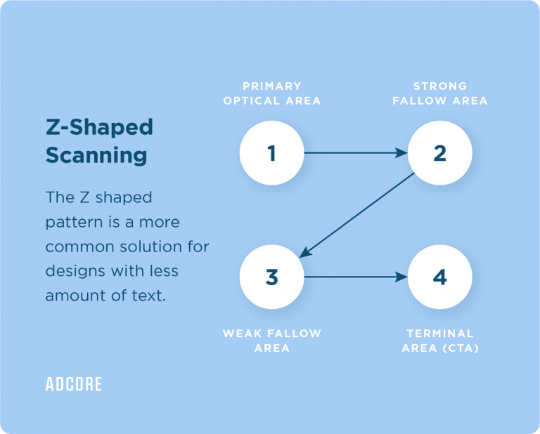
Research shows that people don’t read online content the way they would read a book or a magazine, but they usually scan it instead. This is why the visual organization of a website is so important. There are two main predictable scanning patterns: ‘F’ And ‘Z’ shapes.
Understanding these patterns and choosing which is more suitable for your site will guide you to strategically arranging the elements on your landing page.
The two shape patterns are pretty straightforward to understand. The F-shaped pattern assumes that the user’s eye will scan the website like an F shape, such as start scanning from the top of the page, reading the headline first, then scanning the left side of the page, and lastly, scanning the site horizontally for bold subtitles and bold elements.

What is it good for? F-shape is most common for heavy-text landing pages, assisting the user to scan through the most important information.
If your landing page is not the kind of heavy-text page and more of a visual page – you should consider the Z – shape. Based on this shape, the user scans the site as a ‘Z’ shape. Meaning the user scans the site from left to right and from top to bottom.
What is it good for? If your page is all about visual elements, then you should keep in mind positioning the elements based on the order the user will use them. Put the most important information and a CTA at the top of the page.

3. Placing the USP and main message “under the fold”
I´m sure that it won’t come as a surprise but let me tell you something: only 30% of users scroll down. Only 30%! The part of your web page that is seen before scrolling, is called “above the fold” meaning that 70% of the users won’t even see your content if it’s placed under the fold.
Therefore, make sure to place your USPs and CTA’s above the fold and leave the less important elements or contents under.
Looking for an agency that will do all the hard work for you?
4. Unresponsive designs
When 40% of transactions nowadays are done using mobile devices, one website version for all devices is just not an option anymore. Thus, you have to make sure that your page will be responsive and compatible with all the different devices. We must give our customers the best UI experience no matter which device they’re using.
Imagine how unfortunate it would be if an enthusiastic user wishes to buy your product but couldn’t find the button to make the purchase. Yikes. To avoid this, just make sure to have a mobile version in place that is user-friendly, so the user’s path to conversion is as easy as possible!
Pro tip: There are plenty of useful hacks and tools to tell whether your site is adaptive or responsive. Just bear in mind that you might need some basic programming knowledge.
5. Not implementing tracking
Setting tags properly on your landing pages (and your website pages in general) is like putting on the right glasses for your eyes. You would never get the most accurate data of what’s really happening on your page unless you take this process seriously. With the right tracking, you will be able to understand your user’s journey much better and build your optimization based on it.
Proper tracking is much easier said than done, so if you are not proficient enough with tracking issues, you should consider external help.
Nonetheless, here are a few key tips to know that you are on the right track:
- Make sure you embedded Google Tag Manager on all your website pages.
- Make sure you set up conversions and goals correctly on Google Analytics and double-check that everything works.
- Make sure you are tracking all your ads and campaign activities that lead to your landing pages. Each platform usually has its own conversion tracking tags such as Facebook’s pixel, Google’s Global Site Tag, and so on.
Conversion tracking – Event vs. Thank you page
To measure the success of your landing page, you must know how many people completed the process and, in other words, how many conversions were generated by your landing page. There are two main ways that marketers use to track conversions. One is creating a ‘thank you’ page and the other is creating a conversion event on your Google Analytics.
So, which one should you choose?
- If you have a ‘Thank You’ page, use it! Create a destination conversion by implementing your conversion tag there. This will ensure that every conversion counted is 100% valid. Because if any detail was missing to complete the conversion such as a crash or an error, the user wouldn’t end up on the ‘Thank You’ page.
- If you don’t have a ‘Thank You’ page – You can create an event using a button click. It’s not a perfect solution as every button click would be counted as a conversion, even in the case of an error in a form, etc. However, it will definitely be a valid solution for websites without a ‘Thank You’ page.
Whether you chose a destination conversion or event setup- run a conversion test. Make sure the tag is being fired in the right place, and only there!
Pro tip: There are external tools you can use to check your LP performance. For instance, Hotjar is a great tool to check the users’ journeys on your LP! You can see heat maps of the user on your site, recordings of their actions, and their path to conversion.
When creating your landing page, think of yourself as a user browsing other sites. You wish to get the most important information as quickly as possible and pause on eye-catching content and friendly sites. Otherwise, you’ll probably just leave.
There is no absolute pattern with landing pages, one truth doesn’t apply to all. So keep the A/B testing, consistently push your USPs to be upfront, and think about the way you organize the elements on the page.
Make sure every user has a nice experience using your site by managing a responsive interface. And lastly, keep your eyes open by properly setting the tracking on your site. You got this!
PPC Marketing Expert?
Get things done with Adcore Marketing Cloud.
5 essential PPC tools under one roof.
Related Articles